Monday, May 04, 2009
Exciting news
As a result of working with Rock Events, the director has asked if I'd like to work on the rebrand of Pride London. The second biggest event London hosts on an annual basis, with over 800,000 attendees last year. Updates to follow as and when. Wow!
Sunday, May 03, 2009
A little More-kat
 I've tweaked my debut typeface, Meerkat, so iron out a couple of glitches. Still a long way from finished, all kinds of problems, but I'm determined to get it right. Have a click on the image above for a close-up.
Friday, May 01, 2009
The Collars & Cuffs Ball
My degree-deciding FMP is to design and implement the branding for the inaugural Collars & Cuffs Ball in aid of Battersea Dogs Home. I'm working with Rock Events, who are overseeing the project, but there's a lot of creative freedom and opportunity to get in on a lot of the background work. Should be good.
All the developmental work is to be found on the Collars & Cuffs project blog.
I churned out a vast number (or so it seems) of logo concepts for Rock and we eventually chose a more ornate direction, leading to this:

After discussion, they were very keen to use imagery within the logo. I talked them out of 'cartoon cats, dogs and tiaras' and whittled it down to a very simple version of the tiara, which I'm finally OK with. The design became and currently stands as:

Wednesday, March 25, 2009
D&AD entry: Typography
Brief: Use typography to create a series cover design for Faber Film's range of books that reflects Faber & Faber's long history of typographic excellence.

Faber Films books will be sought out and bought by those with a true passion for film. This design aims to satisfy their desire for a sleek publication which, while remaining sensitive to the intellectual nature of its subject matter, is also an attractive and desirable object in itself. The wraparound cover turns a standard book into a covetable object to be cherished.
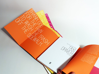
The cover is purely typographic, with the title of the book enveloping the pages completely. The whole title is not fully visible until the wraparound cover is opened entirely, immediately inviting the reader’s interaction with the book as an object. Once the cover unfolds, it draws the reader in further, revealing on its inside panels a key quote from the book set against the bright, bold colour used on the cover – particular colours denote the sub-category to which each book belongs within the series.
The font used throughout has been designed specifically for Faber & Faber, with its clear condensed characters working well to function in both body text and, for the cover title and inside quotation, purely upper-case applications. Used across all the designs, it gives the range of books a particular identity.


Cluster Munitions Coalition poster

Brief: produce poster designs for the CMC, an anti-cluster bomb organisation whose website can be found here.
The CMC’s goal is to protect civilians from the effects of cluster munitions. I wanted to focus on the specific danger of children discovering the bombs and going to touch them or pick them up, unaware of what they actually are. It's a continuing problem. Kids are by nature intrigued by new unfamiliar discoveries and are very tactile, keen to get closer to and interact with objects they find.
Using the visual language of storybook imagery I created a subtle composition which reflects the universal naivety and curiosity of children stumbling across curious objects they cannot identify.
Tuesday, October 14, 2008
MOMIJI: Spread the Love
14.10.08

"You have arrived in the land of Momiji, a sacred place of love, peace, music, chickens, harmony, and stuff."
Momiji dolls are a seemingly infinite range of collectable 'friendship dolls' from Japan. The wide variety of 'cute', brightly-coloured dolls each have a tiny slip of paper hidden within them on which one can write a secret, or a message to an intended recipient of the doll. The brand is kitsch and naive with a central mantra of "Spread the Love"; the ethos of the dolls and the huge range of spin-off products is to promote joy and happiness in simple things.
Subscribe to:
Posts (Atom)
