Wednesday, March 25, 2009

Tuesday, October 14, 2008
MOMIJI: Spread the Love
14.10.08

"You have arrived in the land of Momiji, a sacred place of love, peace, music, chickens, harmony, and stuff."
Momiji dolls are a seemingly infinite range of collectable 'friendship dolls' from Japan. The wide variety of 'cute', brightly-coloured dolls each have a tiny slip of paper hidden within them on which one can write a secret, or a message to an intended recipient of the doll. The brand is kitsch and naive with a central mantra of "Spread the Love"; the ethos of the dolls and the huge range of spin-off products is to promote joy and happiness in simple things.

"You have arrived in the land of Momiji, a sacred place of love, peace, music, chickens, harmony, and stuff."
Momiji dolls are a seemingly infinite range of collectable 'friendship dolls' from Japan. The wide variety of 'cute', brightly-coloured dolls each have a tiny slip of paper hidden within them on which one can write a secret, or a message to an intended recipient of the doll. The brand is kitsch and naive with a central mantra of "Spread the Love"; the ethos of the dolls and the huge range of spin-off products is to promote joy and happiness in simple things.
Tuesday, September 02, 2008
Keeping it in The Family with Le Gun Magazine
With a few fellow students, I spent two weeks helping prepare Le Gun's 'The Family' exhibition, at the Rochelle Gallery, Shoreditch.
Le Gun are an illustration/design collective, who periodically produce a satisfyingly chunky magazine/book collating their own warped illustrations and those of countless contributors. I heard about them in my first year when I went to a lecture by two core members, Neal Fox and Chris Bianchi, whose dedication and refreshingly laid-back, gin-soaked approach completely won us over.
Our relationship with Le Gun was maintained through workshops with Bianchi, illustrator/grand-master bookbinder Billy Bragg, designers Matt Appleton and Alex Wright, and the inimitable Robert Greene. When Billy called for assistance in building a 100%-cardboard living room/arts club for their latest show, we couldn't pass it up.
We went to their Hackney studio to build fully-functional armchairs, sofas and tables using heavy-duty card, tape and many dodgy glue guns, before moving into the gallery to construct what was to become one of the exhibition's highlights.


The exhibition/launch party kicked off on Wednesday August 27th, attracting a huge number of people who drank the bar dry, packed out the gallery space and lounged happily around the cardboard living room. A raucous parade, complete with marching band, guided the masses to a heaving after-party at Cargo, Shoreditch.
It's been a bizarre, insane, disturbing, exhausting pleasure to be part of it all. Special thanks to Billy for letting us get involved to such an extent.
Le Gun links:
LE GUN Official Website
LE GUN Blog
Le Gun on Myspace
"The Family" links
Michele Panzeri's photographs of the exhibition
Eye magazine: Le Gun feature
Review of 'The Family' for The Londonist by Oliver Gili
Le Gun are an illustration/design collective, who periodically produce a satisfyingly chunky magazine/book collating their own warped illustrations and those of countless contributors. I heard about them in my first year when I went to a lecture by two core members, Neal Fox and Chris Bianchi, whose dedication and refreshingly laid-back, gin-soaked approach completely won us over.
Our relationship with Le Gun was maintained through workshops with Bianchi, illustrator/grand-master bookbinder Billy Bragg, designers Matt Appleton and Alex Wright, and the inimitable Robert Greene. When Billy called for assistance in building a 100%-cardboard living room/arts club for their latest show, we couldn't pass it up.
We went to their Hackney studio to build fully-functional armchairs, sofas and tables using heavy-duty card, tape and many dodgy glue guns, before moving into the gallery to construct what was to become one of the exhibition's highlights.


The exhibition/launch party kicked off on Wednesday August 27th, attracting a huge number of people who drank the bar dry, packed out the gallery space and lounged happily around the cardboard living room. A raucous parade, complete with marching band, guided the masses to a heaving after-party at Cargo, Shoreditch.
It's been a bizarre, insane, disturbing, exhausting pleasure to be part of it all. Special thanks to Billy for letting us get involved to such an extent.
Le Gun links:
LE GUN Official Website
LE GUN Blog
Le Gun on Myspace
"The Family" links
Michele Panzeri's photographs of the exhibition
Eye magazine: Le Gun feature
Review of 'The Family' for The Londonist by Oliver Gili
Saturday, June 07, 2008
Bookbinding & triple fold
Hardback binding
Aside from one tutorial with Bill Bragg I hadn't ever done bookbinding before. But with an intricate arrangement of clamps and heavy books I bound them reasonably well. I made a fairly messy job of the hardback covers but was happy overall with the way they worked out. I know where I went wrong so when I next do it, I'll improve.


Triple-fold
To chart the journey each book imparts, I wanted to find a way of including the locations linked to the contents of each page without interrupting the individual page layouts and designs. By triple-folding the edges of a French-fold book I could bury the information in the V-shape this forms, so that it is accessible but not intrusive.


Aside from one tutorial with Bill Bragg I hadn't ever done bookbinding before. But with an intricate arrangement of clamps and heavy books I bound them reasonably well. I made a fairly messy job of the hardback covers but was happy overall with the way they worked out. I know where I went wrong so when I next do it, I'll improve.


Triple-fold
To chart the journey each book imparts, I wanted to find a way of including the locations linked to the contents of each page without interrupting the individual page layouts and designs. By triple-folding the edges of a French-fold book I could bury the information in the V-shape this forms, so that it is accessible but not intrusive.


Thursday, June 05, 2008
Final Outcome: MARKED TERRITORY
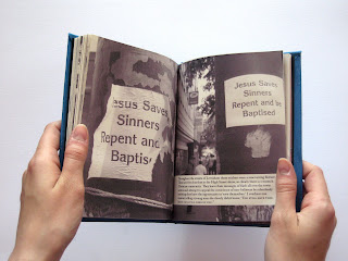
The final three books have turned out well. Through a combination of specially-chosen photos, written passages, illustrations and typography, they demonstrate the psychogeographical differences between regions of London, evident in the marks made on the environment by those who inhabit it.




Tuesday, May 13, 2008
Three Hours From: HACKNEY
The third journey took me around areas of east London, some familiar and some unfamiliar to me. I live in Bethnal Green but don't usually venture much further north from my home in Roman Road. This trip took me up from Mare Street in Hackney up to Dalston, then sent me straight back down to finish in Brick Lane, which is familiar territory to me.
So far this project has seen each outing reveal a theme or underlying trend to the specific journey. This trip around east London didn't immediately throw up any common points but I did notice eventually that a large number of details I was registering were concerned with obvious physical marks that people had made on the streets, ranging from the deliberate (stickers, posters, graffiti, political slogans) to the marks made by people simply living in the particular locations. With such a high immigrant population the area bears the characteristics and marks of the people who live there. Therefore the shops, language, signage and people themselves help paint a picture of the community and those that make it.


So far this project has seen each outing reveal a theme or underlying trend to the specific journey. This trip around east London didn't immediately throw up any common points but I did notice eventually that a large number of details I was registering were concerned with obvious physical marks that people had made on the streets, ranging from the deliberate (stickers, posters, graffiti, political slogans) to the marks made by people simply living in the particular locations. With such a high immigrant population the area bears the characteristics and marks of the people who live there. Therefore the shops, language, signage and people themselves help paint a picture of the community and those that make it.


Where Next?
I'm a bit stuck now.
Initially I wanted to create a series of books, each relating to a different journey and dealing with the content in a different way - illustrative, typographic, photographic etc. Now I have many photographs, many notes, many points to make, but I'm unsure now where to take it all. I have way, way too much information.
I want to pick three journeys to compare and contrast the different areas in terms of the people there, and the way people and place relate. South Ken being upmarket with its royal history reflects this in the cleanliness and architectural detailing, for example, whereas Hackney is scruffy, weathered and rough-round-the-edges, with a high immigrant population and some very underprivileged neighbourhoods. The people I saw and heard in each place varied hugely and I got some great images of a few of them.
Outcome: MARKED TERRITORY series
Three books, each focusing on one journey, documenting the marks people make on their environment and what this tells us about their relationship with their surroundings, both current and historical. The books will tell the story of the areas' people using type, illustration and photography.
Initially I wanted to create a series of books, each relating to a different journey and dealing with the content in a different way - illustrative, typographic, photographic etc. Now I have many photographs, many notes, many points to make, but I'm unsure now where to take it all. I have way, way too much information.
I want to pick three journeys to compare and contrast the different areas in terms of the people there, and the way people and place relate. South Ken being upmarket with its royal history reflects this in the cleanliness and architectural detailing, for example, whereas Hackney is scruffy, weathered and rough-round-the-edges, with a high immigrant population and some very underprivileged neighbourhoods. The people I saw and heard in each place varied hugely and I got some great images of a few of them.
Outcome: MARKED TERRITORY series
Three books, each focusing on one journey, documenting the marks people make on their environment and what this tells us about their relationship with their surroundings, both current and historical. The books will tell the story of the areas' people using type, illustration and photography.
Subscribe to:
Posts (Atom)
