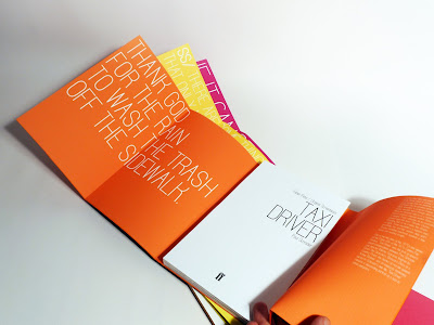
Faber Films books will be sought out and bought by those with a true passion for film. This design aims to satisfy their desire for a sleek publication which, while remaining sensitive to the intellectual nature of its subject matter, is also an attractive and desirable object in itself. The wraparound cover turns a standard book into a covetable object to be cherished.

The cover is purely typographic, with the title of the book enveloping the pages completely. The whole title is not fully visible until the wraparound cover is opened entirely, immediately inviting the reader’s interaction with the book as an object. Once the cover unfolds, it draws the reader in further, revealing on its inside panels a key quote from the book set against the bright, bold colour used on the cover – particular colours denote the sub-category to which each book belongs within the series.
The font used throughout has been designed specifically for Faber & Faber, with its clear condensed characters working well to function in both body text and, for the cover title and inside quotation, purely upper-case applications. Used across all the designs, it gives the range of books a particular identity.


1 comment:
I want these! Your work is consistently stunning, really fantastic stuff.
Post a Comment